Information design
There is no consensus on what constitutes information design. In general, information design is understood to be a method of producing and presenting information for most effective understanding, generally via graphics and visuals. While visuals require information designers to incorporate aesthetics, the focus remains on ensuing accuracy and clarity rather than only attractiveness. There are various types of visuals produced by information designers, but the most prolific are visualizations and infographics. As explained by Robert Kosara, the “key difference between a visualization and a data-based infographic” is the following:
|
Infographics are specific. Each infographic is “made for a particular dataset, for a particular purpose”, and so are usually handmade it.
|
Data visualizations are general. Visualizations are made by programs, and are able to quickly input any data set into an existing technique to produce a visualization.
|
|
|
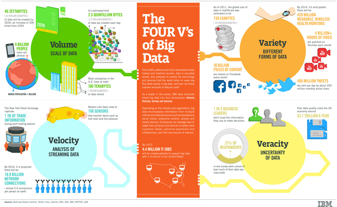
However, data visualizations and infographics are not mutually exclusive. Often information designers may embed data visualizations into an infographic, such as in the form of charts, graphs, and the like.
Big Data Rhetoric and visualizations
Information design deals with the presentation of large data sets, especially in the case of visualizations. Thus Big Data rhetoric informs the principles and practices of information design. In fact, visualizations came about due to the need to access, organize, and present an influx of information into a format more readily interpretative to the human mind (Sack 2011). In "Aesthetics of Information", Warren Sack states that, "[f]aced with huge volumes of data, scientists and engineers [wrote] computer programs to render data as images making it possible to visually search for and scrutinize patterns in the data" (1).
High data volume remains the defining characteristic of Big Data. Through the use of programming, computers have allowed scholars to engage with the ever larger data sets in Big Data to develop multiple visualization techniques. The resulting visualizations make visible quantifiable data that by itself remains invisible (Manovich 2002), letting the human mind see the previously unknown patterns and connections in the world. This develops the narrative of the information designer (or data scientist) as discoverer; she is someone who looks through her algorithmic lens and uncovers some hidden law or reaction for the first time.
The secondary characteristics of Big Data include the high rate of data production and increasing variety of data sets. Visualizations allow data analysts to juxtapose multi-various information onto a single landscape to determine potential correlations, or take related sets of data and put it all together for further interpretation. Interactive visualizations, like the OECD Better Life Index, allow users to toggle the various elements that stay on the screen, thereby providing different interpretive frames. Information designers focus on compacting large data sets and varied information to fit onto a page. Lev Manovich (2002) describes this determination "to map [previously incomprehensible] phenomena into a representation whose scale is comparable to the scales of human perception and cognition" as a preference for the anti-sublime. That is, information design rejects the notion that any phenomena is beyond human sensory perception or reason. Visualizations exist to organize information for maximum clarity and effective understanding, usually within the confines of a browser page (Manovich 2002).
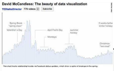
Finally, visualizations, as an alternative medium of Big Data, maintains that data speaks for itself. The purpose of visualizations is to provide useful insight into patterns and provide solutions, without subjective human bias. The general, computer generated data visualization provides greater objectivity over the particular contextualized infographic (Kosara). However, even for automated data visualizations, the choice of visualization technique and parameters affect outcome. As such, epistemic tensions arise within information design between the Platonic notions of absolute truth (and knowledge) and the (technologically) contingent understanding of truth. Introducing aesthetic variables via design principles further complicates the claim towards objectivity by Big Data. These tensions become evident in David McCandless's TED talk.
High data volume remains the defining characteristic of Big Data. Through the use of programming, computers have allowed scholars to engage with the ever larger data sets in Big Data to develop multiple visualization techniques. The resulting visualizations make visible quantifiable data that by itself remains invisible (Manovich 2002), letting the human mind see the previously unknown patterns and connections in the world. This develops the narrative of the information designer (or data scientist) as discoverer; she is someone who looks through her algorithmic lens and uncovers some hidden law or reaction for the first time.
The secondary characteristics of Big Data include the high rate of data production and increasing variety of data sets. Visualizations allow data analysts to juxtapose multi-various information onto a single landscape to determine potential correlations, or take related sets of data and put it all together for further interpretation. Interactive visualizations, like the OECD Better Life Index, allow users to toggle the various elements that stay on the screen, thereby providing different interpretive frames. Information designers focus on compacting large data sets and varied information to fit onto a page. Lev Manovich (2002) describes this determination "to map [previously incomprehensible] phenomena into a representation whose scale is comparable to the scales of human perception and cognition" as a preference for the anti-sublime. That is, information design rejects the notion that any phenomena is beyond human sensory perception or reason. Visualizations exist to organize information for maximum clarity and effective understanding, usually within the confines of a browser page (Manovich 2002).
Finally, visualizations, as an alternative medium of Big Data, maintains that data speaks for itself. The purpose of visualizations is to provide useful insight into patterns and provide solutions, without subjective human bias. The general, computer generated data visualization provides greater objectivity over the particular contextualized infographic (Kosara). However, even for automated data visualizations, the choice of visualization technique and parameters affect outcome. As such, epistemic tensions arise within information design between the Platonic notions of absolute truth (and knowledge) and the (technologically) contingent understanding of truth. Introducing aesthetic variables via design principles further complicates the claim towards objectivity by Big Data. These tensions become evident in David McCandless's TED talk.
